Tools like GitHub Copilot, ChatGPT, and various web design tools can generate CSS for you. So why are we still learning it?

You are building the mental model that lets you:
Think of it like architecture: architects don't lay bricks themselves, but they must understand structural principles to design buildings that stand up.
English (natural language) is the new programming language that values high-level design, vision, and taste where individuals can be the author of highly catered software as architects, rather than mastery of code.... but you still need to know what you're asking for.
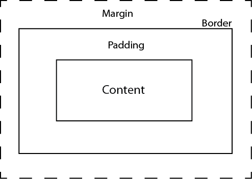
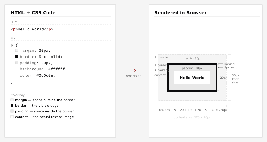
The Box Model
Every HTML element is treated as a rectangular box made of four layers (from inside out):
border-style property: specifies type of border. none, dotted, dashed, solid, double, groove, ridge, inset, outset, and inherit
border-width property: specifies how wide the border around the box should be
border-color property: specifies the color
Or if you choose, you can use a shortcut property:
selector { border: style width color;}
body {
border-style: solid; /* none, dotted, dashed, solid, double, groove, ridge, inset, outset, inherit */
border-width: 1px;
border-color: blue;
}
div {
border: solid 3px red;
}
body{
border: solid 1px blue;
padding: 5px;
margin: 10px;
}
p {
border: dashed 2px;
background: gray;
padding: 10px;
margin: 15px;
}
Options for Margins and Padding
p {
margin: 10px; /* 10px around top, right, bottom, left */
}
div {
margin: 10px 20px; /* 10px top and bottom, 20px right and left */
}
body {
margin: 10px 20px 30px 40px /* 10px top, 20px right, 30px bottom, 40px left in clockwise order */
}
img {
margin-top: 10px;
margin-left: 5px;
}
You can change whether an element is block or inline by using the "display" property with three possible values (block, inline, and none). List items by default is a block element, and hence every list element is listed in a new line like this:
item 1 item 2 item 3 item 4
If you want them to appear inline:
li {
display: inline;
}
and it will be displayed like this:
item 1 item 2 item 3 item 4
To control the size of the block, use width and height properties.
div {
width: 80%; /* 80% of browser width */
height: 500px; /* 500px tall */
}
If the contents are larger than the box:
div {
width: 80%;
height: 500px;
overflow: hidden; /* visible, hidden, scroll, auto */
}
height: 100%;For some reason (because we scroll up & down?), height needs to be explicitly specified. If not, it will be calculated with respect to the element that it is contained in. Ultimately somewhere along the line, you need to specify the height of the parent element. [see more here]
Without the fix, html and body have no explicit height, so height:100% on the div has nothing to measure against.
<html>
<head>
<style>
div { height:100%; background:magenta; }
</style>
</head>
<body>
<div>height:100% on this div, but html/body are left at their default height.</div>
</body>
</html>
With the fix, html and body are also set to height:100%, so the div has something to be 100% of.
<html>
<head>
<style>
html, body { height:100%; margin:0; }
div { height:100%; background:magenta; }
</style>
</head>
<body>
<div>Now html, body, and this div are all height:100%.</div>
</body>
</html>
Sample file [11_content_complete.html]
position property static value: default (everything flows down the page from left to right, top to bottom)
relative value: positions the element relative to its normal position
absolute value: locates the elements where you specify
fixed value: fixes the element in place even if the page is scrolled (may not work on all browsers)
Used in together with the top, left, bottom, and right properties that specify a corner
/* this will be placed 10px, 100px from the top of the browser window */
.intro {
position: absolute;
top: 10px;
left: 100px;
}
/* this will be placed 20px upward relative to where it would be otherwise */
.abstract {
position: relative;
top: -20px;
}
Block-level elements flow down the page from top to bottom. The float property lets an element be pushed to the left or right so that other content wraps around it. The options are left, right, and none.
img {
width: 300px;
float: right; /* text will wrap around the left side of the image */
}
A related property is clear. It stops content from wrapping — useful when you want an element to appear below a floated element instead of beside it.
footer {
clear: both; /* none, left, right, both */
}
Is float still used? Yes — but for a specific purpose: wrapping text around an image, like in a magazine or article. For building navbars, sidebars, and multi-column page structure, Flexbox and Grid (covered next) are the modern approach.
Flexbox is designed for one-dimensional layout — arranging items in a single row or column and controlling how they align and distribute space.
Set display: flex on the container. Its direct children become flex items that line up along the main axis.
.container {
display: flex;
flex-direction: row; /* row (default) or column */
justify-content: center; /* alignment along main axis */
align-items: center; /* alignment along cross axis */
gap: 10px; /* space between items */
}
Key properties:
flex-direction: row (left→right, default), column (top→down), or their reversesjustify-content: flex-start, center, flex-end, space-between, space-aroundalign-items: flex-start, center, flex-end, stretchflex-wrap: wrap: lets items wrap to the next line instead of overflowinggap: shorthand for spacing between itemsCSS Grid is designed for two-dimensional layout placing items into rows and columns at the same time, like a spreadsheet or floorplan.
Set display: grid on the container, then define your columns and rows:
.container {
display: grid;
grid-template-columns: 1fr 2fr 1fr; /* 3 columns; middle is twice as wide */
grid-template-rows: auto auto; /* 2 rows; height fits content */
gap: 15px; /* space between all cells */
}
Key concepts:
grid-template-columns / grid-template-rows: define track sizes using px, %, or frfr unit: fraction of available space — 1fr 1fr 1fr = three equal columnsrepeat(): shorthand — repeat(3, 1fr) is the same as 1fr 1fr 1frgap: spacing between grid cellsgrid-column: 1 / 3; (spans from line 1 to line 3)| Tool | Dimensions | Best for | Analogy |
|---|---|---|---|
float |
— | Text wrapping around an image | Magazine article with an inset photo |
| Flexbox | 1D (row or column) | Navbars, button groups, card rows | A single shelf — items sit in a line |
| Grid | 2D (rows and columns) | Page structure: headers, sidebars, footers | A floorplan — place things into defined cells |
Rule of thumb: Use Grid for the overall page structure, Flexbox for the items inside each section, and float only when you want text to flow around an image.
In practice, Flexbox and Grid are often used together on the same page.
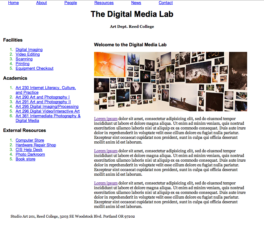
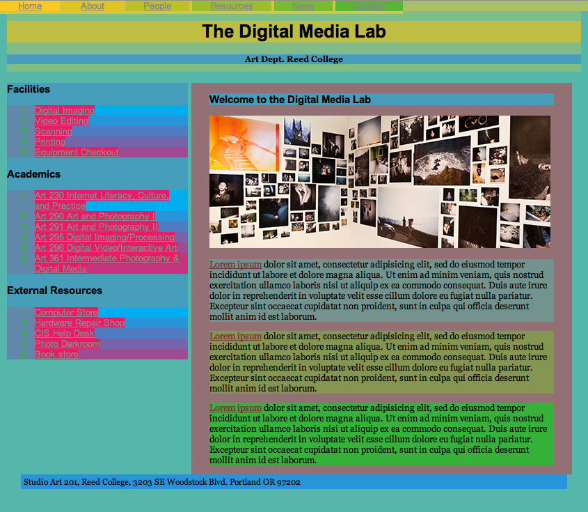
Goal: reproduce the same target layout three times using an AI coding agent to write the CSS, moving through three levels of vocabulary as you go: first precise CSS/HTML terms, then plain English, then an image with no words at all. Your job each time is to write a precise description, constrain which technique the agent is allowed to use, and judge whether the result matches.
Files:
Starting file (unstyled): dml_layout.html
Layout target for Versions 1 and 2 (black & white): css_screen_capture_bw.png
Full design target for Version 3 (color included): css_screen_capture.png
dml_layout.html has no wrapper divs, ids, or classes at all, on purpose. For this lab you (or your agent) may add wrapper elements (div, span, etc.), ids, and classes as needed.dml_layout.html for each version below, named dml_layout_v1.html, dml_layout_v2.html, and dml_layout_v3.html, so all three end up side by side for comparison.css_screen_capture_bw.png and your copy dml_layout_v1.html. Use the position property to lay out the page.
You may code the CSS by hand and ask for help if you're not sure how, or you may describe the layout using precise CSS/HTML vocabulary and ask an AI tool to write it for you. For example: "Position the <h1> tag with the text 'The Digital Media Lab' at the top center."
dml_layout_v2.html, targeting the same css_screen_capture_bw.png layout.
Try to recreate it using only CSS Grid (display: grid).
Describe the design to the AI in plain English this time, not CSS terms, but do tell it explicitly to use CSS Grid.
css_screen_capture.png directly, working from your copy dml_layout_v3.html.