Scrolls overlapping in style, text, layout and content
Most hell scrolls were probably produced in workshops with an almost assembly-line mentality -- e.g. designers using pounced stencils and specialists drawing a limited number of stereotyped images in segmented layouts. This study collection includes a number of scrolls that clearly overlap one another in style, text, layout and content. This order is intentional and ranked by degree of fragility. That is, it's rare to find scrolls overlapping in all four categories, and if there are to be differences, the style - its figuration, color scheme, etc. - seems to be the first to fail in reproduction, followed by text, layout and content. Yet this order is conjectural because our sampling is too small and too dependent on a chance gathering of scrolls.
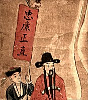
In this first side-by-side comparison, scrolls A10 and S07 overlap in all four categories with only subtle differences here and there. Differences in style are very limited - e.g. the design of the roof eaves, an added window to the side of the judge's chamber, a gentleman's robe that is brown in one scroll, blue in the other. In terms of textual differences, there are none, and both include a lengthy inscription entitled "Amitabha Buddha's statement of mourning for this world" in addition to smaller inscriptions scattered throughout the scrolls. While one scroll (A10) was part of the original Kagle collection and hence last located in Taiwan, the other scroll (S07) was purchased in Shanghai. Yet their similarities are so strong as to suggest coming from the same workshop.
As noted above, the first category to be most vulnerable to change seems to be that of the style, of how particular images are drawn and painted. That is not to say they can't still overlap in a general style. These first three comparisons can still be categorized together within a singel general style grouping when compared to the fourth and fifth which are each of very different general styles. Here within this first general style category, it is still easy to detect differences in particular executions in this and the next comparison.
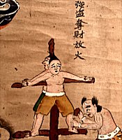
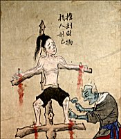
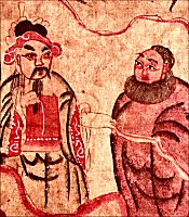
Unlike the first comparison, the next four comparisons all differ in style of figuration and color even though the text (at least in part), the layout and the content can remain the same. When here comparing A06 and S09, note that the layout and content are identical and that the text also partially overlaps. (For example, the couplets around the magistrate are the same, but the texts identifying particular tortures and crimes differ.) Yet even though every figure's stance and gesture overlap, the execution of the figures is very different.
To see a side-by-side comparison of A06 and S09, click HERE.
Scrolls overlapping in layout and content I
In this comparison, A04 and S18 are still clearly related to one another in terms of general (but not particular) style, layout and content, but now there is little overlap in text. In fact, the difference in texts goes so far as to identify each as a completely different hell, the former being the fourth hell of Wuguan and the latter being the eighth hell of Pingdeng.
This difference in turn highlights a corrective that must be made when studying these scrolls. Earlier work such as that of Wolfram Eberhard, while otherwise extremely useful, wrongly assumed norms in terms of what tortures went into which hells. Eberhard identified variances as mistakes. Yet it's very clear that, with a few exceptions, there is no normatiive assignment of tortures or crimes to particular hells. They were apparently arranged by the pragmatic concerns of the artisans making these scrolls.
Scrolls overlapping in layout and content II
Moving beyond the A series, this comparison is between a scroll from the I series (which is a complete set) and S04 (which is an orphaned scroll). While the two scrolls can't be compared in terms of text (because S04 has none), they are clearly related in terms of general style and overall layout, although the layout of the upper half seems to have more variances than the lower half.
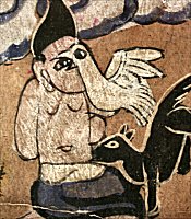
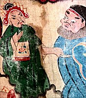
Once again, the layout and content are the same when comparing S01 and S02, but there is no text on either scroll and so no comparison can be made in terms of that category. Painted on canvas, these particular scrolls clearly have their own shared general style that makes them distinct from the first three comparisons (which together form one general style group) and from the fourth comparison (which is clearly a second style group). Yet there are clear differences in how particular people are rendered on this pair such as the monk in the middle, round-faced and brown-robed in S01, becomes bulbous cheeked and blue-robed in S02.